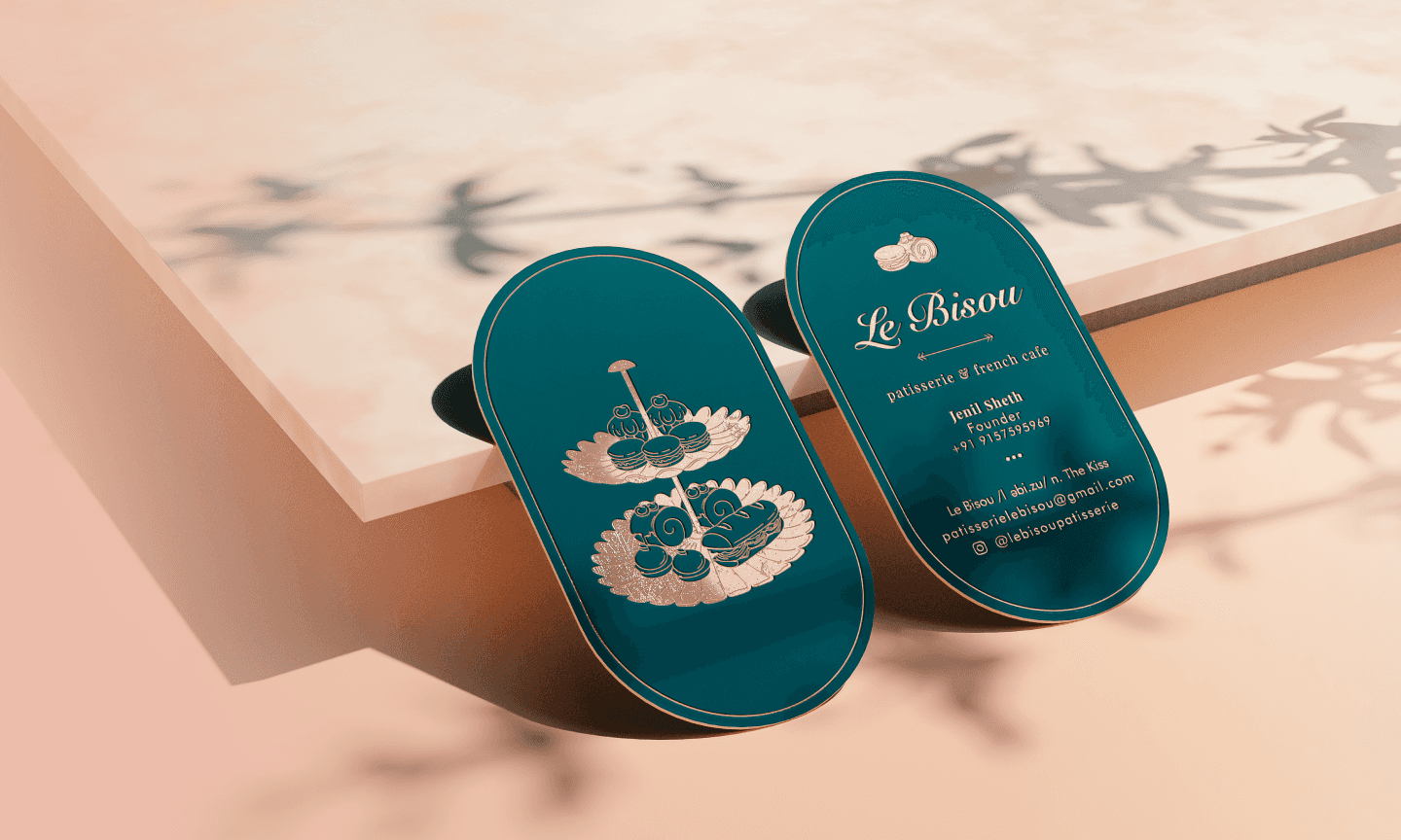
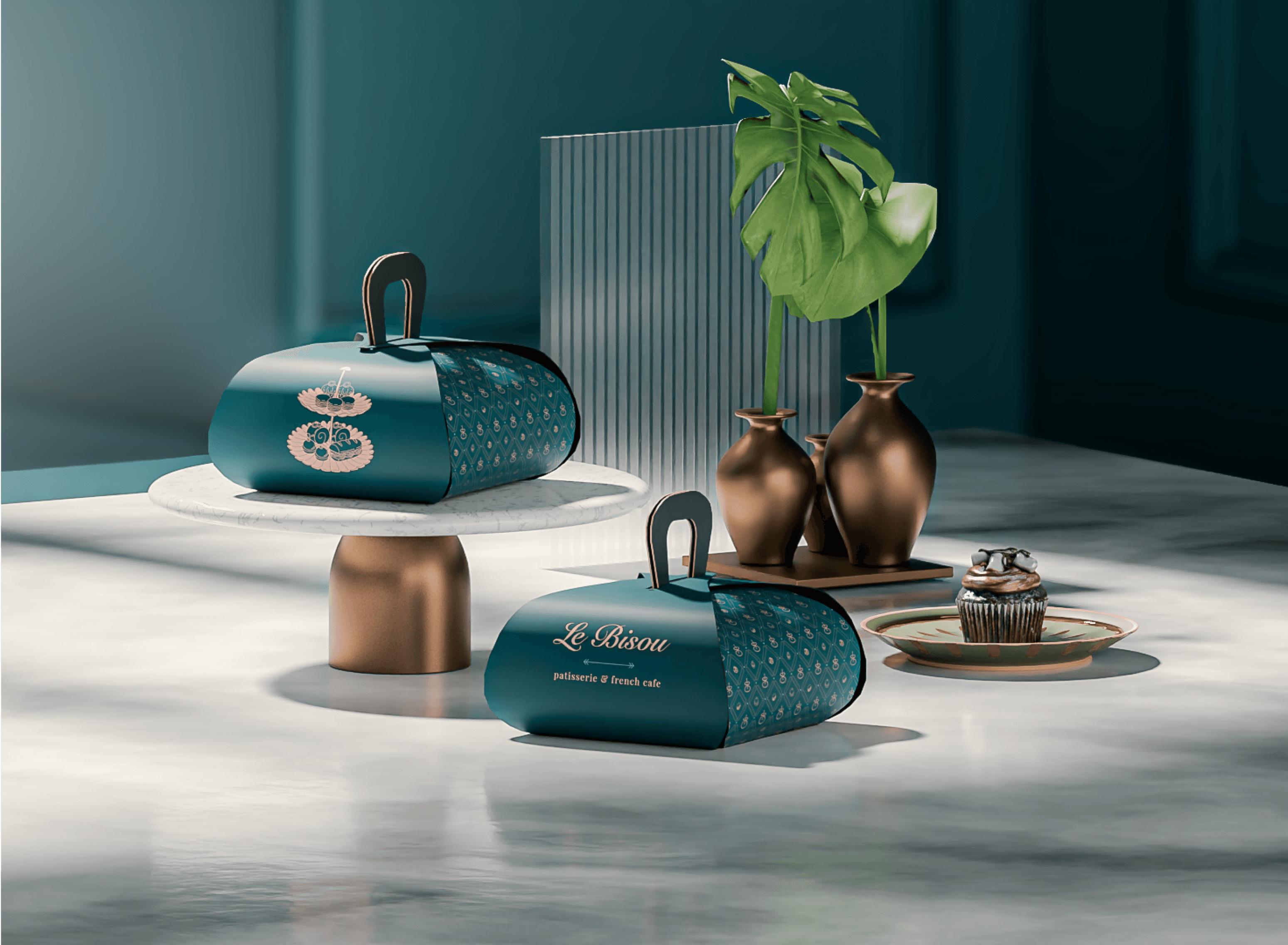
Coup de foudre means love at first sight. Since LeBisou was branded to be the best depiction of love, and fondness, its entire visual identity revolved around the same idea; of making people fall in love, with everything, from its ambiance, to its food and also its packaging.
Coup de foudre means love at first sight. Since LeBisou was branded to be the best depiction of love, and fondness, its entire visual identity revolved around the same idea; of making people fall in love, with everything, from its ambiance, to its food and also its packaging.
01

Logo Connection
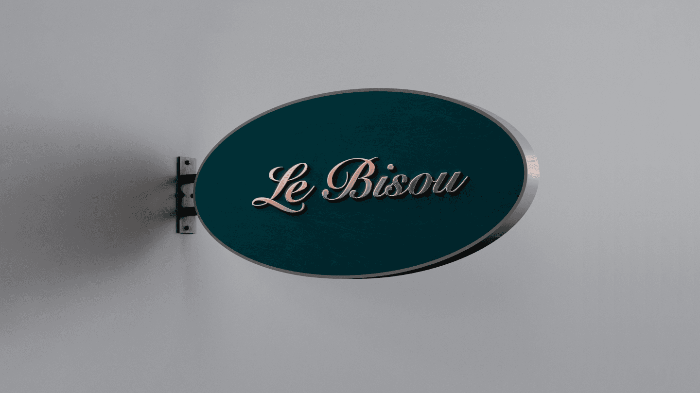
‘Le Bisou’ means ‘The kiss’ and the logo needed to visualize the sensuality of the word itself. With curves of the fonts, it attracts the viewers in just the right way.

Typography
The textual logo is made with Bold Serif fonts that create the luxurious and classic mood. The letters have been stripped down to the minimum to bring home the minimalistic aspect.

